Domani
A calm, habit-focused planning app designed to help users trust tomorrow's decisions
Product Context & Design Challenge
Domani is a task planning app designed around a specific moment: planning the night before. The core idea was to create a focused alternative to bloated productivity tools that attempt to do everything, often overwhelming users and undermining follow-through.
Users want to feel calm, focused, and in control as they plan their day. However, many planning and productivity tools emphasize task density, reminders, and rigid workflows, which can increase stress rather than reduce it.
The insight driving Domani is that execution struggles often stem from planning at the wrong time. When users plan in the moment (rushed, reactive, already stressed) they make decisions they don't trust. Domani separates planning from execution intentionally, built on the principle that decisions made while calm lead to better follow-through than decisions made under pressure.
The challenge was to design a system that:
- Helps users make decisions without overthinking
- Encourages follow-through without pressure
- Separates planning from execution to reduce cognitive load
- Feels supportive rather than demanding
Product Hypothesis
Planning the night before helps users start the day with clarity instead of hesitation. When morning arrives, there's no need to second-guess or debate priorities because decisions were already made while calm and clear-headed.
Domani supports execution by helping users trust those prior decisions. The product is intentionally designed to reduce re-planning, minimize choice during execution, and reinforce commitment rather than constant adjustment.
Key UX Decisions & Iterations
Each design decision was driven by user feedback and a commitment to maintaining calm, intentional planning.
Moving away from a "tech startup" visual tone
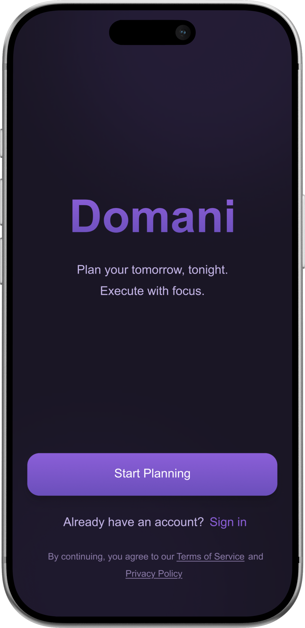
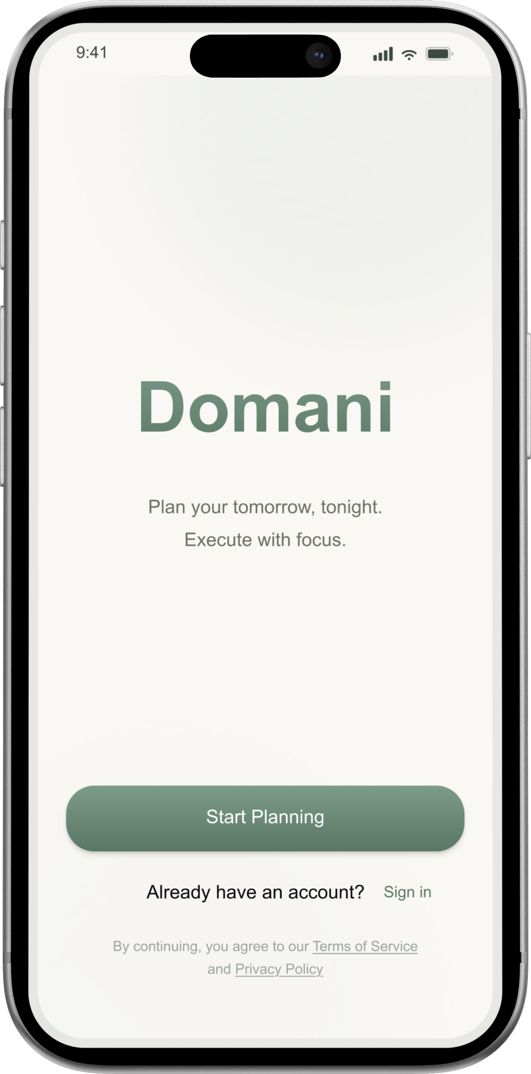
The app's color palette shifted from a dark, high-contrast purple to a lighter sage-green palette.
Feedback on early designs indicated the darker palette felt too "tech startup" and productivity-driven, which conflicted with Domani's goal of supporting calm, reflective planning and habit formation.
The palette was adjusted to feel more lifestyle-oriented and approachable, reinforcing Domani as a habit-building tool rather than a high-pressure productivity app.
Evolving the task priority model
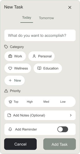
The priority system evolved from a simple High / Medium / Low model into a four-tier structure with a single capped Top Priority task.
Early versions limited users to one "High" priority task per day. Feedback revealed this didn't reflect real planning behavior, as many users legitimately consider multiple tasks high priority.
The restriction on high-priority tasks was removed, and a single Top Priority was introduced and capped at one per day. This preserved flexibility while still encouraging users to identify the most important outcome for the day.
Separating planning from execution
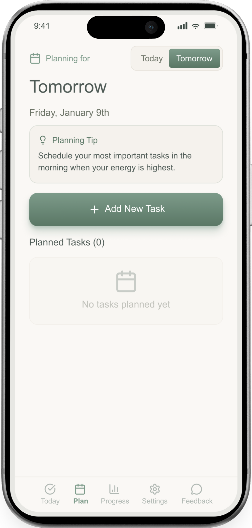
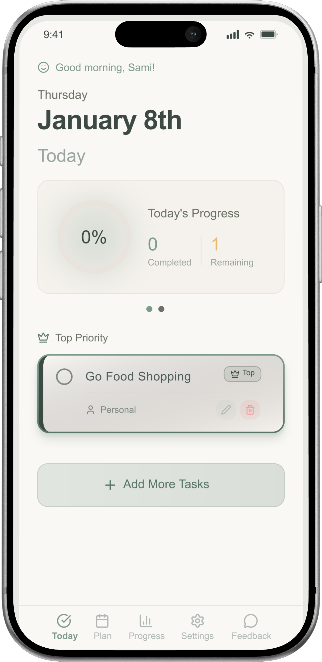
Planning and execution were intentionally separated into distinct experiences rather than combined into a single screen or flow.
Planning and execution occur in different mental states. Planning is reflective and calm, while execution is reactive and time-sensitive. Combining both increased friction and encouraged re-prioritization.
Users plan tasks the night before, then return the next day to a focused execution view. Each mode is designed around its specific needs: intention during planning and momentum during execution.
This separation reduced morning decision fatigue and reinforced trust in previously made decisions.
Balancing reminders without increasing anxiety
Reminders were designed to support follow-through without creating pressure, while allowing users to opt in when needed.
Many productivity apps rely on aggressive notifications, which can increase anxiety and avoidance. Feedback showed users wanted reminders, but only when they felt helpful.
Instead of enforcing reminders by default, Domani introduced optional, user-defined reminders at the task level. This preserved a calm core experience while supporting individual planning styles.
Users who wanted reminders could enable them, while others could rely on their original plan without feeling monitored or pressured.
Reflection
Domani is currently live in public beta, with a full launch planned in the coming weeks. The product was designed from the ground up as a focused alternative to bloated task managers, prioritizing clarity, restraint, and habit formation over feature density.
Design decisions throughout the project were guided by emotional timing rather than optimization metrics. Planning happens at night, when users are calmer and more reflective. Execution happens later, when the goal is momentum, not decision-making. Each interaction was shaped to respect those different mental states.
Rather than relying on aggressive reminders or complex systems, Domani supports follow-through by helping users trust the decisions they already made. The result is a lightweight experience that feels supportive instead of demanding, and intentional rather than prescriptive.
Key Challenges & Learnings
Learning to separate actionable feedback from subjective preference
Receiving feedback at scale during public beta surfaced a wide range of opinions and feature requests. Not all feedback pointed to a real problem, and many suggestions reflected personal preference rather than underlying user need.
I learned to slow down, look for patterns, and validate whether feedback addressed the root issue before deciding if it warranted a design change.
Re-centering on the perspective of first-time users
Deep familiarity with the product occasionally clouded design judgment. When flows began to feel obvious to me but confusing to others, I had to consciously step back and design from the perspective of users encountering the app for the first time.
This helped realign decisions around clarity rather than internal logic.
What This Project Demonstrates
End-to-end product design ownership from problem framing through live beta
Strong judgment around simplifying experiences instead of adding features
Ability to design for emotional context, not just functional requirements
Comfort iterating based on feedback without losing the product's core intent
Close collaboration with engineering while leading UX decisions
What's Next
As Domani approaches full launch, the focus will be on refining interactions, learning from real usage patterns, and strengthening the habit loop without increasing cognitive load. Future iterations will continue to prioritize calm, clarity, and intentional use.
View More Case Studies
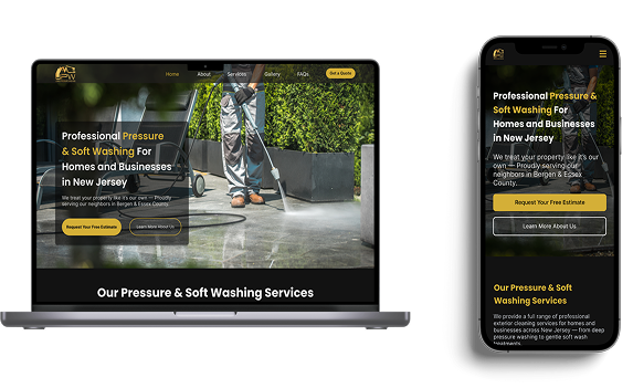
Jones Pressure Washing
Commercial UX - Trust & Decision Clarity
Helped a new local service business earn user trust without reviews or brand recognition. Led UX strategy, information architecture, and content decisions to reduce perceived risk, clarify services quickly, and guide high-intent homeowners toward confident quote requests in a competitive market.
Read Case Study
360 Degree Care
Emotional UX - Accessibility & Reassurance
Shaped a trust-focused digital experience for families navigating high-stakes care decisions. Led UX and content strategy to support emotionally stressed users through clear information hierarchy, accessibility controls, and calm, confidence-building interaction patterns.
Read Case Study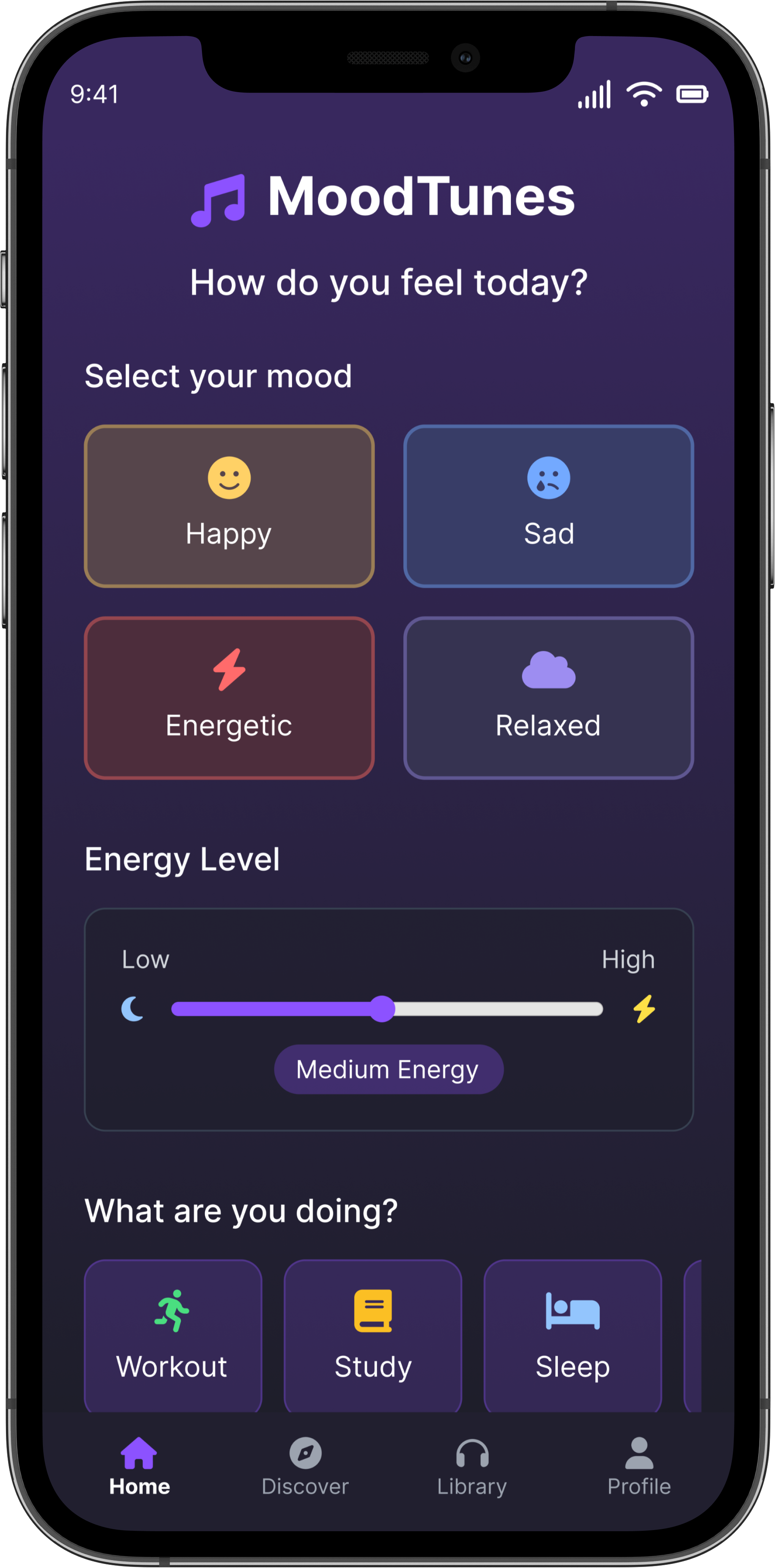
MoodTunes
Conceptual Product UX - Interaction Design
Explored a mood-first approach to music discovery that prioritizes how users feel in the moment over listening history. Designed a lightweight interaction model focused on reducing friction at entry, limiting choice to maintain momentum, and surfacing discovery without overwhelming users.
Read Case Study