Sami Fares

MoodTunes - UX Case Study

Designing a music discovery experience that adapts to how you feel in the moment.

(Conceptual product design project)

MoodTunes - UX Case Study mockup

0.0 Problem Framing – Music That Matches the Moment

Music streaming platforms are highly effective at recommending content based on past listening behavior. Over time, this creates familiarity, but it often limits discovery and emotional relevance.

Users frequently return to the same playlists for focus, workouts, or relaxation because existing systems are optimized around history, not real-time context. When mood, energy, or intent changes, users are left to manually search, filter, or settle for music that only partially fits the moment.

This project explores a different approach to music discovery, one that starts with how a user feels right now, rather than what they've listened to before.

0.1 Project Overview

Context

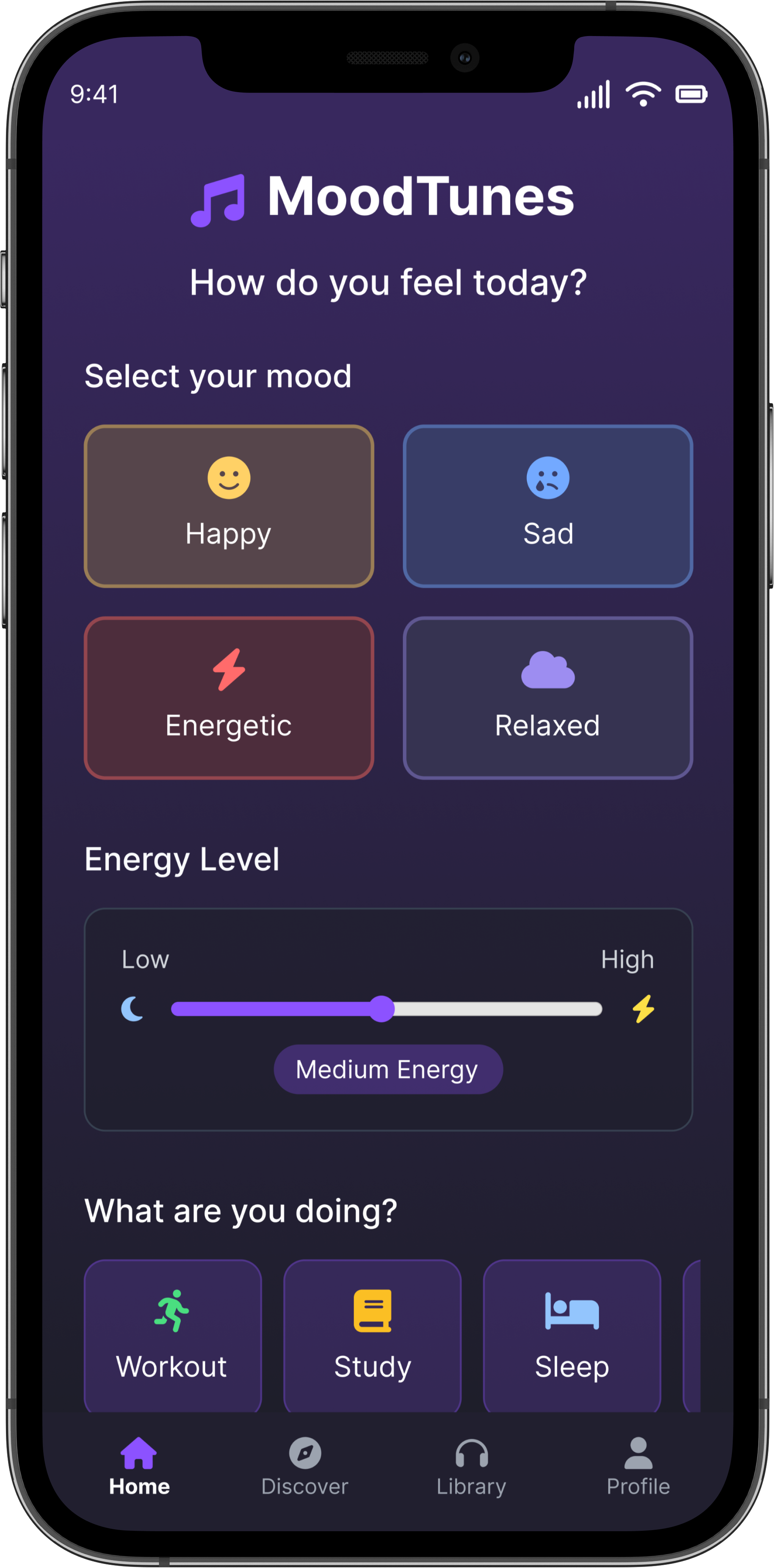
Moodtunes is a conceptual mobile music app exploring how music discovery can adapt to a user's current mood, energy level, or activity. Rather than relying primarily on listening history, the concept centers on giving users a simple way to express how they feel in the moment and receive playlists aligned to that context.

This project was created as a self-initiated product exploration, allowing me to focus on product thinking, emotional UX, and mobile-first interaction design within a deliberately scoped concept.

Moodtunes served as a way to explore alternative discovery patterns in the music space without attempting to design a fully production-ready application.

My Role

UI/UX Designer, Product Thinking, Copywriting

Client

Conceptual Music App

Timeline

8 weeks

Tools

Figma, Web Research, AI-assisted ideation

Deliverables

Key user flows

Conceptual wireframes

Selected high-fidelity screens

0.2 UX Hypothesis: Designing for Mood, Energy, and Intent

Moodtunes explores the hypothesis that music discovery becomes more meaningful when users can express how they feel in the moment, rather than relying solely on past listening behavior.

Drawing from my background in music and sound design, I explored how elements such as tempo, energy level, and overall sonic character influence emotional and cognitive states like focus, relaxation, or motivation. While Moodtunes does not attempt to model these relationships scientifically, the concept uses these principles as directional inputs to guide playlist grouping and UI tone.

The goal was not to overwhelm users with controls, but to create a lightweight interaction that allows them to signal intent quickly and receive music that feels emotionally aligned. This hypothesis informed both the structure of the input flow and the overall pacing, color, and density of the interface.

Because Moodtunes is a conceptual project, design decisions were evaluated based on clarity, emotional resonance, and internal UX logic rather than performance metrics or live user testing.

0.3 Concept Validation & Design Inputs

Rather than conducting formal user research, I used lightweight validation to ground the concept in observable behavior. This included reviewing how existing music platforms approach discovery and identifying where those experiences fall short when users want music that fits their current mood or activity.
Across platforms, discovery systems are highly optimized for familiarity and past listening behavior, but provide limited ways for users to express intent in the moment. When mood or energy changes, users are often left to manually search, reuse old playlists, or compromise with music that only partially fits how they feel.
These observations reinforced the direction behind Moodtunes and informed the interaction model. Instead of competing on depth or personalization, the concept focuses on a simple input flow that allows users to quickly signal intent and begin listening.

0.4 Interaction Model & Key Design Decisions

1

Replacing search with a mood-first entry point

Decision

Instead of relying on search, genres, or artist selection, the experience begins with mood and activity inputs.

Rationale

This intentionally removes precision in favor of speed, acknowledging that users often know how they feel faster than they can describe what they want to hear.

2

Treating energy as a spectrum, not a category

Decision

Energy was designed as a continuous slider rather than preset labels.

Rationale

This avoided forcing users into rigid states and allowed for subtle adjustment without introducing additional controls or decision overhead.

3

Limiting visible choice after playlist generation

Decision

Once a playlist is created, the interface minimizes visible options.

Rationale

This was a deliberate tradeoff: reducing control in order to encourage listening and maintain momentum, rather than pulling users back into browsing behaviors.

4

Integrating local artists without dedicated discovery surfaces

Decision

Local artists were surfaced through subtle labels within playlists instead of standalone sections.

Rationale

This allowed discovery to occur passively, without shifting attention away from the user's original intent or reframing the experience around exploration.

0.5 Final Designs & Reflection

This project reinforced my approach to product UX when working without formal data, testing infrastructure, or production constraints. Rather than attempting to simulate a full build, I focused on making deliberate interaction choices, defining clear boundaries, and designing only what was necessary to support the core experience.

MoodTunes strengthened my confidence in designing through abstraction, making tradeoffs early, and resisting the urge to over-specify solutions. It also reinforced the importance of aligning interface complexity with user intent, especially in experiences meant to support background or emotional states rather than direct task completion.

Final Designs

Design showcase 1
Design showcase 2
Design showcase 3

What This Project Demonstrates

  • Ability to make confident design decisions without relying on exhaustive research or metrics
  • Strong judgment around scope, restraint, and feature prioritization
  • Comfort designing systems based on qualitative reasoning and domain knowledge
  • Cross-domain thinking, applying an understanding of sound and emotional response to interaction design
  • Ownership of product thinking from concept through interface execution

View More Case Studies

    Domani example image

    Domani

    Product UX - Systems & Iteration

    Designed a calm, habit-building planning app focused on reducing decision fatigue and helping users follow through on daily intentions. Led product UX from concept through iterative refinement, shaping core interaction models that separate planning from execution and lower cognitive load. Currently in public beta and evolving toward launch.

    Read Case Study
    Jones Pressure Washing example image

    Jones Pressure Washing

    Commercial UX - Trust & Decision Clarity

    Helped a new local service business earn user trust without reviews or brand recognition. Led UX strategy, information architecture, and content decisions to reduce perceived risk, clarify services quickly, and guide high-intent homeowners toward confident quote requests in a competitive market.

    Read Case Study
    360 Degree Care example image

    360 Degree Care

    Emotional UX - Accessibility & Reassurance

    Shaped a trust-focused digital experience for families navigating high-stakes care decisions. Led UX and content strategy to support emotionally stressed users through clear information hierarchy, accessibility controls, and calm, confidence-building interaction patterns.

    Read Case Study