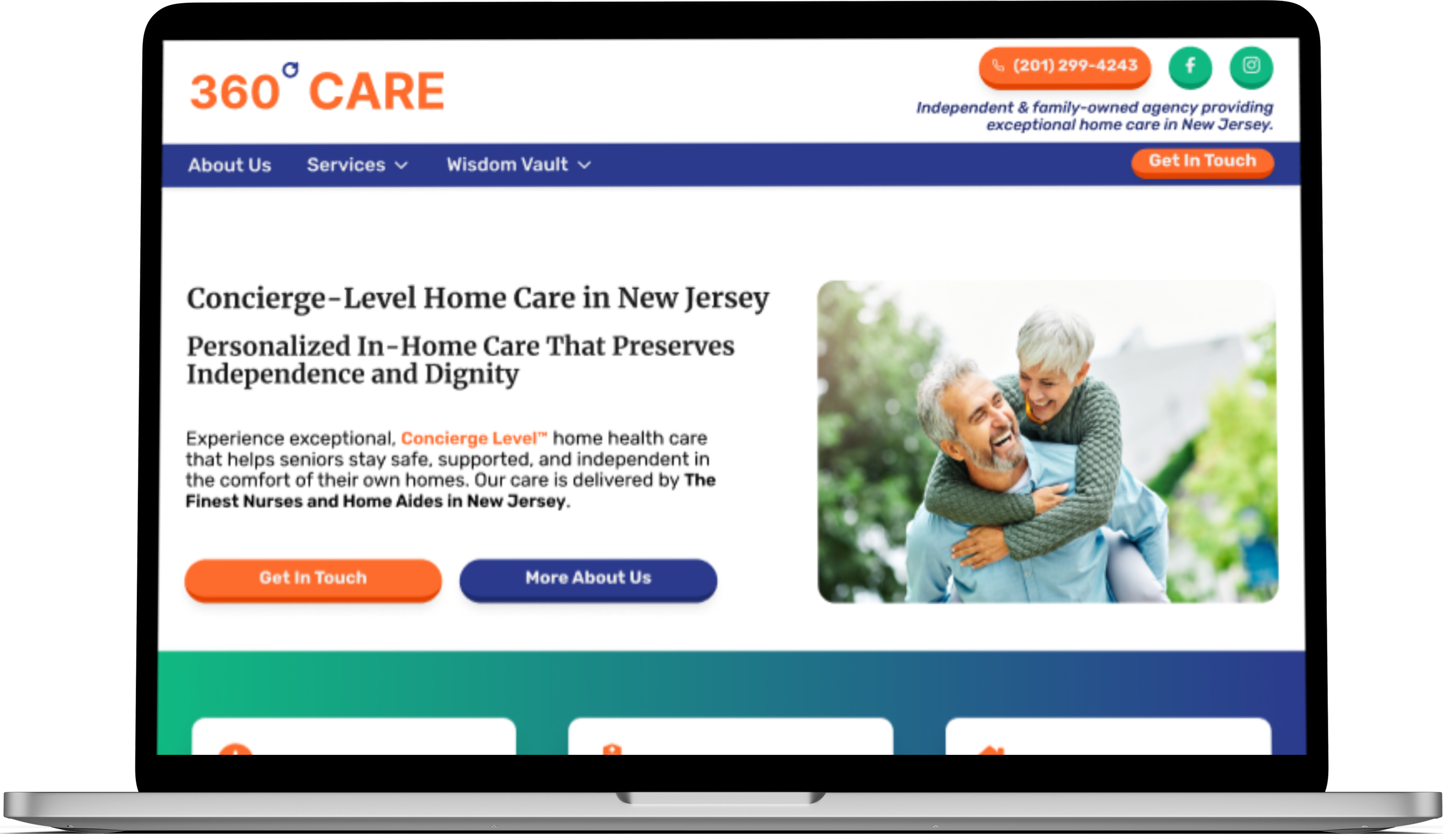
Sami Fares

360 Degree Care - UX Case Study

Designing a trust-focused digital experience for families navigating high-stakes in-home care decisions

360 Degree Care - UX Case Study mockup

0.0 Problem Framing - Creating Digital Trust for a New Care Brand

360 Degree Care was a newly established in-home care provider in New Jersey with no digital presence. In a crowded and highly sensitive industry, families searching online had no reviews, reputation, or existing brand signals to rely on.

The core challenge was not just building a website. It was creating a digital experience that could establish trust quickly, communicate care quality clearly, and support users making emotionally difficult decisions under time pressure.

Poor UX in this context would not simply frustrate users. Confusion or uncertainty could delay decisions or prevent families from reaching out at all.

0.1 Project Overview

Context

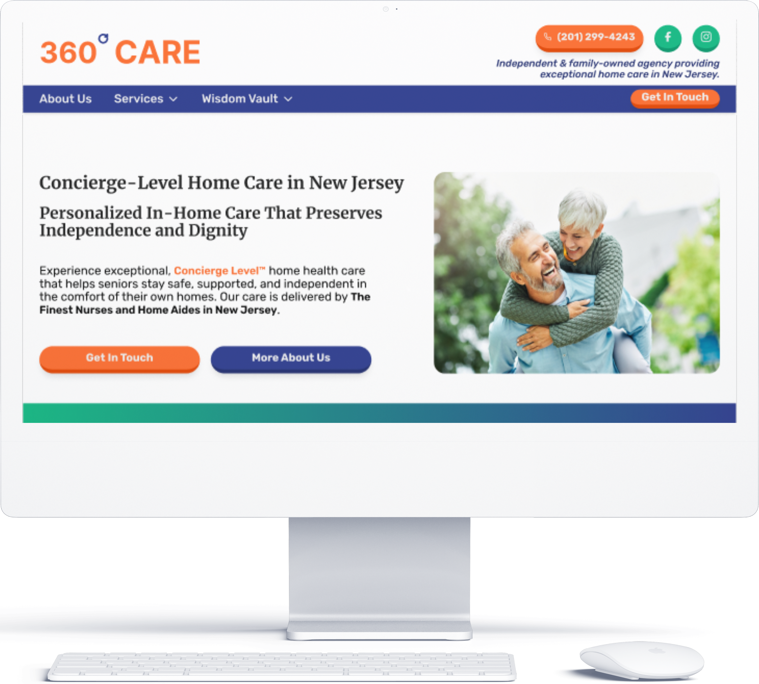
360 Degree Care needed its first website to establish legitimacy, communicate services clearly, and support early lead generation. I led the UX and design process from discovery through execution, working closely with the client and developer to balance user needs, accessibility, and strong stakeholder preferences.

My Role

UX Designer, Content Strategy, UI Design

Client

360 Degree Care, New Jersey

Timeline

8 weeks

Tools

Figma, Google Docs, Competitive Research

0.2 Project Goals and Constraints

Client Goals

Establish credibility for a new care provider

Clearly communicate services, coverage areas, and next steps

Support emotionally stressed users with calm, readable content

Encourage contact without aggressive sales pressure

Constraints

No prior digital presence or social proof

Strong stakeholder preference for oversized typography

Limited time and content availability

Accessibility considerations across a wide age range

Client-driven visual direction that evolved throughout the project

0.3 Research & Discovery

I began with a competitive review of in-home care agencies in northern New Jersey, focusing on messaging tone, information hierarchy, and how competitors addressed trust and emotional reassurance.
I also conducted informal discovery through conversations with friends and family members who had recently searched for care services. These discussions highlighted the stress, uncertainty, and urgency families experience during this process.

"When you are in a position where you need to find care for a loved one, it can be scary. It feels like you are trusting the person you hire with their life."

Mario G

Key Research Takeaways

Visitors scan quickly for clarity around services, availability, and location

Calm imagery and empathetic language increase trust

Clear FAQs and repeated contact opportunities reduce hesitation

Overly sales-driven or modern designs can feel cold in this context

0.4 Key UX Decisions & Tradeoffs

1

Supporting diverse readability needs through user control

Problem

Families researching in-home care include users with varying visual abilities and comfort levels with digital content, creating competing readability needs.

Risk

Making large typography the default could improve accessibility for some users while introducing hierarchy breakdowns, excessive scrolling, and visual fatigue for others.

Decision

Avoid enforcing a single readability standard and instead allow users to control how content is presented.

Solution

I worked with the developer to implement a global accessibility control that allows users to: Increase or decrease text size, Enable high-contrast and negative contrast modes, Apply grayscale and light background modes, Switch to a readable font option, Reset preferences at any time. User preferences are stored locally so accessibility settings persist across visits.

Tradeoff

This added implementation complexity, but preserved clarity and hierarchy while supporting a wider range of accessibility needs.

2

Prioritizing information hierarchy to reduce cognitive load

Problem

Users evaluating care options need to quickly understand services, coverage, and next steps without processing dense or unstructured information.

Risk

Unclear hierarchy or excessive content density could increase cognitive load and slow decision-making.

Decision

Design the information architecture to surface essential details early and guide users toward action without pressure.

Solution

Content was structured to support fast scanning by: Breaking services into clearly labeled sections, Using concise headings and scannable content blocks, Repeating primary CTAs at natural decision points, Making service scope, availability, and next steps immediately visible

Tradeoff

This limited visual experimentation, but improved comprehension and ease of navigation for first-time visitors.

3

Establishing trust through local relevance and legitimacy cues

Problem

With no reviews or established digital footprint, users lacked external validation signals when evaluating the provider.

Risk

Without clear indicators of legitimacy, users could hesitate or delay outreach despite understanding the services offered.

Decision

Use visible local context and transparent service explanations to establish credibility within the experience itself.

Solution

Trust was reinforced by: Clearly explaining services and care approach, Surfacing service areas and availability early, Integrating location-specific references, Maintaining a calm, empathetic tone across key pages

Tradeoff

Emphasizing clarity and locality required disciplined content decisions, but reduced hesitation and increased user confidence.

0.5 Final Designs & Reflection

This project focused on designing a digital experience that could establish trust quickly for families making emotionally difficult care decisions. Under a tight timeline and strong client-driven visual preferences, the final experience prioritized clarity, emotional reassurance, and accessibility to support confident decision-making in a high-trust industry.

The resulting site provides a calm, legible, and structured experience that helps users understand services, assess legitimacy, and take next steps without pressure.

Final Homepage Design

Design showcase 1

Key Outcomes

  • Established a credible digital presence for a new in-home care provider
  • Improved user understanding of services, coverage areas, and next steps
  • Reduced hesitation through clear content hierarchy and repeated contact opportunities
  • Supported ongoing lead generation through calls and form submissions

Lessons Learned

  • Strengthened communication and alignment with non-technical stakeholders
  • Practiced balancing strong client preferences with user-centered design principles
  • Reinforced the importance of accessibility in emotionally sensitive decision contexts
  • Applied qualitative research insights to concrete UX decisions under real constraints

Client Feedback

"I'm really happy with how everything turned out. You were flexible, patient, and always found a way to make my ideas work. I appreciate how you took the time to explain things and still delivered something polished and easy to use."

- Owner, 360 Degree Care

View More Case Studies

    Domani example image

    Domani

    Product UX - Systems & Iteration

    Designed a calm, habit-building planning app focused on reducing decision fatigue and helping users follow through on daily intentions. Led product UX from concept through iterative refinement, shaping core interaction models that separate planning from execution and lower cognitive load. Currently in public beta and evolving toward launch.

    Read Case Study
    Jones Pressure Washing example image

    Jones Pressure Washing

    Commercial UX - Trust & Decision Clarity

    Helped a new local service business earn user trust without reviews or brand recognition. Led UX strategy, information architecture, and content decisions to reduce perceived risk, clarify services quickly, and guide high-intent homeowners toward confident quote requests in a competitive market.

    Read Case Study
    MoodTunes example image

    MoodTunes

    Conceptual Product UX - Interaction Design

    Explored a mood-first approach to music discovery that prioritizes how users feel in the moment over listening history. Designed a lightweight interaction model focused on reducing friction at entry, limiting choice to maintain momentum, and surfacing discovery without overwhelming users.

    Read Case Study